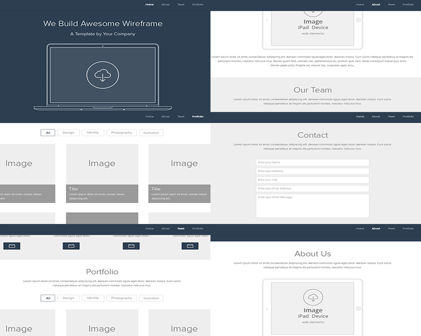
Single page websites are amazing examples of organization, simplicity, and preciseness. Managing data on a single page seems impossible at first but after executing it successfully your website will give your customers an incredible experience.
After going through various results on a search engine, a visitor finally lands on your page and you have only one shot, one opportunity to make it worth it. For a single page website, there are several things that you need to keep in mind. Is the content well organized? Is it easier to navigate through the website? What are the chances that your client will click on your Call to action? These are some of the factors you need to keep in mind while developing a single page website.
Below is a list of how to overcome navigation issue from a single page website:
- 1) Standard style :
Placing your navigation in the right place makes it easier for the visitor to scroll through your website. A visitor usually expects the horizontal navigation to be placed at the top and vertical navigation at the left.
A standardized navigation ensures an increase in the number of visitors, lower bounce rates and hence more probability of conversions.
Your ultimate aim is to make sure that the content is easily available to the customer. - 2) Descriptive labels :
Apparently, it is seen that most of the websites use labels like “Products” or “About us”. So how does that make your website different from your competitors is a question? Be a little specific about your products. For example, if you have a business that sells earphones, then mention the label as “Earphones”.
Your labels also impact your website’s ranking on Google. Remember, your customer is searching for “Headphones “and not “Products” or “Services” - 3) Prevent using drop-down navigation :
According to a survey, users find it irritating to navigate through the drop down menus. When a visitor is looking for some product or service, he usually clicks on it. If you give me more options through a drop-down menu, you are confusing him.
In addition to that, drop down menus sometimes cover the important content of your website. If you have a single page website with limited content, you need to ensure that no content is hidden.
So, if you are getting lesser clicks and higher bounce rates, try to get rid of that drop down menu. - 4) Avoid a long list of products in your navigation :
If you have a single page website it is understood that you need to utilize every space, but that doesn’t mean that you can stuff unwanted content on your page. It is seen that most of the websites have a long list of products and services on the navigation menu. That is just annoying!
If your website has few items to offer, there are more chances that your customer will go through every product. - 5) Right order for the right product :
According to psychology, a visitor is most likely to click on the first and the last item while navigating through a menu. This is known as “Serial position effect”. So you should place high priority content at the beginning and at the end of your menu. The remaining items can be placed in the middle.
Website navigation is one of the key aspects of any business. If you ignore it now, your business might suffer in the near future. For your satisfaction try out the techniques mentioned above on your website and see the difference. It is most likely that your conversions will increase, bounce rates will go down and your ranking will improve.


